5. V FOR VENDETTA
Producer Joel Silver and art director Ron Michelson were sparked with this idea after purusing the Russian Boshevik-era posters at the Tate Gallery in London. ''I wanted people to feel as if the posters came directly from the movie,'' Silver said. ''If we were actually going to mount a revolution here, what would the imagery look like?'' So the axis is skewed, the color palette is stripped to shades of red, black and tan, and the credit block becomes a design element itself. If only all movie posters could stand on their own like so, and feel so closely connected to their film's tone and content.
4. NACHO LIBRE
Perhaps this is just an excuse for me to plug a movie I loved that most people didn't. But the poster is just like the movie: you'll love it if you love Jack Black. This poster shows you exactly what you're in for, and it tells the uninterested to keep moving along. It's really perfect.
3. VOLVER
According to the poster for the new Pedro Almodovar film, the only thing you need to know about VOLVER is that it stars Penelope Cruz, and that she's lovely. And that pretty much is all you need to know. The cartoony flowers, in simple, bold colors and varied patterns, perfectly suit Almodovar's almost magical style. I just love this artwork, that's all there is to it.
2. LITTLE MISS SUNSHINE
Say what you will about the year's most talked-about Little Indie Film That Could, but you've gotta give it credit for having its visual template locked in: make everything yellow. I love the negative space, the simple font, and the picture, which playfully piques your curiosity if you don't know the premise. Rumor has it that the movie's press packets include yellow toy Volkswagen buses: now that's good marketing. And I want one for my toy collection.
1. THE GOOD GERMAN
No surprise here. The poster for Steven Soderbergh's Post-WWII murder mystery pays a direct homage to this CASABLANCA poster from the 40's.
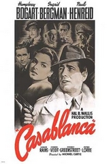 It lifts the curved, painted lettering of the title, the top marquee, the faded montage of supporting characters, and creates a border out of a crumbling landscape. By adding a deep red wash behind Clooney and Blanchett, and adding a tagline, the poster seems both antique and contemporary; I would've liked them to go all the way with a painted portrait. Still, this poster isn't a postmodern gimmick, it's just more gorgeous and eye-catching than any other posters in the multiplex.
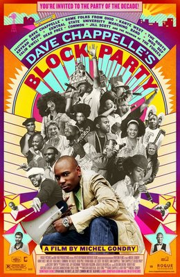
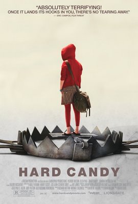
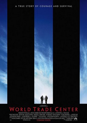
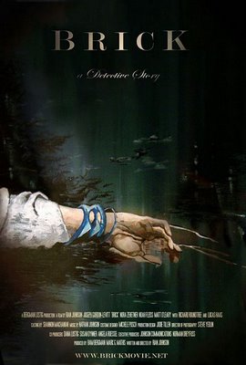
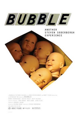
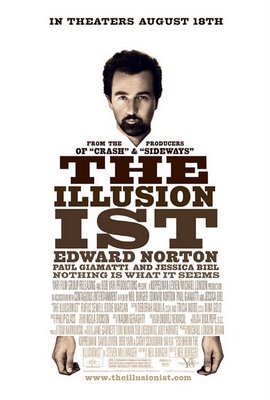
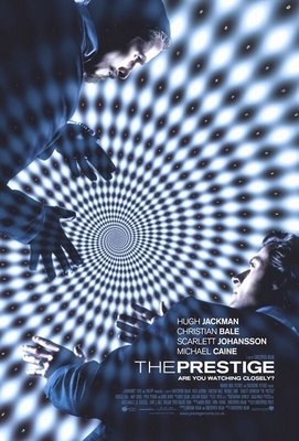
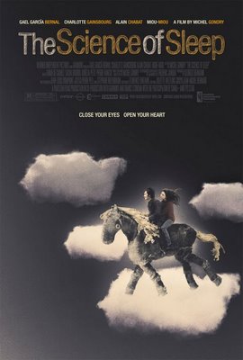
Compiling this list was a little harder than I expected. So I'll leave you with a few other 2006 posters that caught my eye. Many times a movie's alternate poster -- one released by the studio secondarily, after a more formulaic one-sheet -- is more interesting, as seen below. Because, of course, average moviegoers can't digest interesting or experimental posters. Thanks for reading, and let me know what posters you liked this year.


0 Yorumlar